- Launched for testers at http://preview.microsoft.com
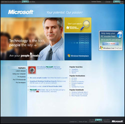
- As before it’s sprayed with Blue, but a nicer one this time.
- The background image looks like diluted ink flowing on the glass...
- With content images in opposite colours
- Navigation on top and the footer in black background gives a good control over the page
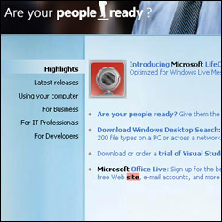
- Left navigation is already implemented as a trial in the current version…perhaps to test and to make people handy with this kind of “hovereading”. Needs less clicks and fit more content
- Will be finally launched probably in November, 06 or early January, 07
- And yes, the page is centralised this time
- The home page is 400Kb(11 Javascript files alone are contributing 30% of this)
- Lack of whiteness disturbs long readings…as it is one of the most visited websites, it should reserve some whiteness, especially behind the reading content...
But most likely, Microsoft will launch the final skin with some new inputs that were not present in the preview. Let’s see.
Here are a few snapshots: